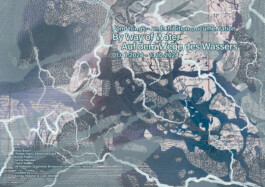
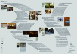
Double sided Poster for exhibition “By Way of Water” by Bärenzwinger Berlin

By Way of Water (“Auf dem Wege des Wassers”), curated by Annika Reketat and Cleo Wächter, was the third installment in Bärenzwinger Berlin’s Kanten und Knoten (“Edges and Knots”) program. This exhibition explored the multifaceted role of water as a social, political, and artistic medium within urban space.
● Services
Poster Design.
● Strategy
The poster was developed in close alignment with Bärenzwinger Berlin's visual identity and the curatorial concept of the exhibition. My approach focused on visually translating the exhibition's central theme, water as a connector and transformative element, into a compelling design.
● Design
The double-sided poster reflects the idea of fluidity and confluence by layering organic forms, typographic flow, and translucent elements. Inspired by the hydro-cartographic and hydrofeminist narratives within the show, the layout plays with visual permeability, echoing how water moves through and across boundaries. The typography is carefully arranged to create a rhythmic, almost tidal motion, inviting the viewer to engage with both the physical and conceptual layers of the exhibition.

Double sided Poster for exhibition “By Way of Water” by Bärenzwinger Berlin

By Way of Water (“Auf dem Wege des Wassers”), curated by Annika Reketat and Cleo Wächter, was the third installment in Bärenzwinger Berlin’s Kanten und Knoten (“Edges and Knots”) program. This exhibition explored the multifaceted role of water as a social, political, and artistic medium within urban space.

● Services
Poster Design.
● Strategy
The poster was developed in close alignment with Bärenzwinger Berlin's visual identity and the curatorial concept of the exhibition. My approach focused on visually translating the exhibition's central theme, water as a connector and transformative element, into a compelling design.
● Design
The double-sided poster reflects the idea of fluidity and confluence by layering organic forms, typographic flow, and translucent elements. Inspired by the hydro-cartographic and hydrofeminist narratives within the show, the layout plays with visual permeability, echoing how water moves through and across boundaries. The typography is carefully arranged to create a rhythmic, almost tidal motion, inviting the viewer to engage with both the physical and conceptual layers of the exhibition.